Jawg visual identity through time
We changed our visual identity after 3 years because it's very important for a brand. It helps to distinguish a brand from the crowd of other business.

The visual identity is something important for a brand. It helps to distinguish a brand from the crowd of other business and know its business sector. That's why we decided to change our logo after 3 years.
The beginning with DesignMyMap
Let's start with a bit of story. Jawg has started in June 2015 as a project from takima. At first, Jawg was named DesignMyMap, this name was inspired from the parent project DesignMyApp.
The main purpose of DesignMyMap was to create and deploy a personalized map with your POIs on your own server in the cloud in one click (on Amazon, Google Cloud, OVH...). The back-end was complex to manage, but it was possible for a carto-newbie to have its own tile server on its server.
We did our best to have the simplest UI so that the user cannot see the complexity of the installation (download the data, import in PostgreSQL, start the tile server, start the POI manager, notify when all is done....).
At this time, our logo was a chimera, the mix of the DesignMyApp logo above a map. Yes, this is not the most beautiful and meaningful logo we can create...
Thanks to DesignMyMap, we learnt a lot about cartography, we earned an expertise in tile servers and cartography. At this time, we understood that not everybody wants to manage its own tile server because this can be complicated and for some business it's not something they want to worry about.
Our independence with mapsquare
In October 2015, we decided to use our expertise in order to create a SaaS infrastructure. For this brand new service, we choose a new name and visual identity, the chosen one was mapsquare. Mapsquare came from our activity (map/cartography) and square, a place where we can share, talk and also for the tile format (which is a 256x256 square in raster).
At this time, our logo was simple, we chose a font that we loved with one blue color to separate the two words of our brand, map and square. Here, our logo has no link with our activity but was easy to make.
For the typography of the brand, we used the same font family and color as the logo. That means maps in white (or black) and square in blue. We did this to highlight our activity which is the cartography/maps.

In order to avoid some legal issues with a company, we had to give up the name mapsquare. We had a few weeks to find a new one, spoiler alert: we found it !
New name, new identity: Jawg
The Japanese radar
After our adventures, we found our new name in May 2016: Jawg or Jawg Maps. The story of this name is atypical, the CEO of takima found it on Wikipedia, it's the code name of a Japanese radar named J/AWG. It was short and interesting, so simple to remember.
You must know, a name change is never easy. We already had some customers, so we had to communicate our new name/website. This was the new era, when Jawg took off as a cartography alternative.
From this time, we decided to have something a bit more sophisticated with a hidden link to our name. Yes, our logo represented radar waves (the blue part of the logo) with the J of Jawg. This had been created by the graphic artist of takima.
For Jawg, we kept the same font as mapsquare and the alternation of colors (white/black and blue) but we changed the blue and took the one of the logo obviously.

The map pin
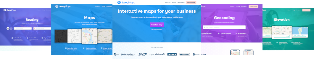
Now, our visual identity needs to get closer to our activity, that's why we changed our logo again, to increase the link with our map identity. We have decided to do a global rework of our visual identity, that means creating a new logo and a new website. We worked with a graphic artist that already knew us and our activity, this helped her to be more efficient and understand well what we wanted.
The work started in June 2019 and we started to work on wireframes for our new website, as we wanted to improve the user experience. After this part and our approbation, the graphic artist make some proposal for the new logo and typography and started the work on the UI design of the website. We got 3 logo examples and it was easy to choose. The difficult part was the typography, how to write JawgMaps correctly and which font should we use ?
We released our new logo and website on September 19, 2019. It's a J for Jawg and also a POI that refers to our activity. We have two variants, the gradient and the rounded which can be blue or white.


We had several font examples, but none of them got the unanimity. The font we chose was the one used in the UI design which was very nice. Now we have a new typography for JawgMaps where Jawg is bold and Maps is regular in order to distinguish the brand. We wanted to maintain this distinction for people, because at Jawg, we do Maps.

Check our new website.